Conditionally coloured arrows in KPI objects
Conditionally coloured up/down arrows, independent of your primary KPI value are possible in the Qlik Sense KPI objects and this is one of those really nice touches that adds another dimension in terms of using shapes and colours to simplify understanding metrics.
To do this requires two master measures per KPI object.
1. Create the primary measure
The first measure in the KPI object is the primary value eg an expression such as Sum ( Sales ). I’m calling this measure Sales ($).
2. Create the secondary measure
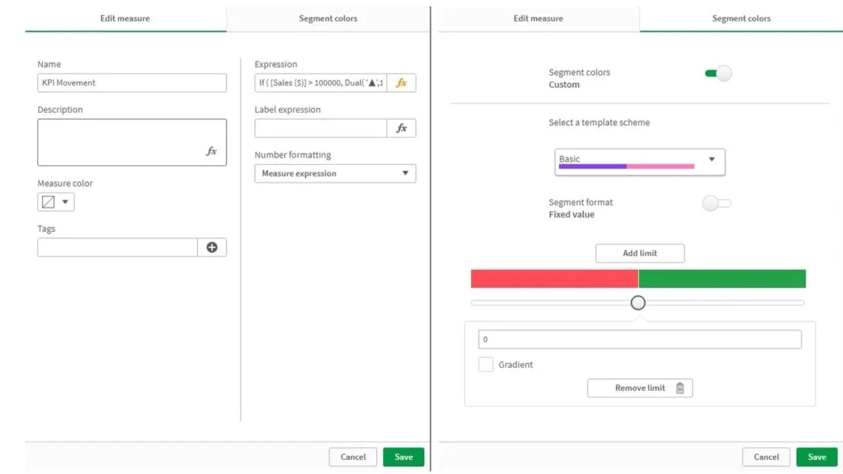
The second measure is where the magic happens. I’m calling this measure KPI Movement with the code:
If ( [Sales ($)] > 100000, Dual( '▲',1 ), Dual ( '▼', -1) )
With the KPI Movement measure created, set the Number Formatting to Measure expression then select the Segment colors tab and:
Enable the Segment colors option
Disable segment format
Ensure there are two limits at the bottom with the midpoint set at 0
Define the lower and upper boundary colours (for example red and green)
3. Create the KPI object
Add the primary and secondary measures to the KPI (primary measure e.g. Sales ($) should be the first measure added).
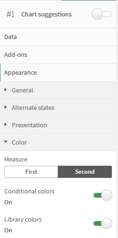
The final step is to update the colour properties in the object for the second KPI value, to do this:
Select Appearance > Color > Second
Enable the Conditional colors and Library colors options


